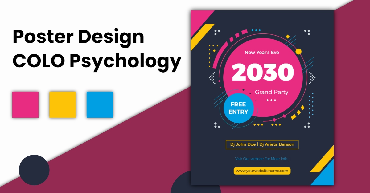
Posters are like visual poems, and the colors used in their design play a crucial role in conveying emotions, capturing attention, and leaving a lasting impression. When you embark on the journey to design a poster, explore the palette that speaks to your message and resonates with your audience. Create a visual masterpiece that tells a story, evokes emotions, and stands out with the perfect blend of colors by using the best poster maker. In this exploration journal of poster design color psychology, we’ll delve into the fascinating world of colors and discover how they impact our emotions, thoughts, and reactions.
Poster Design Color Psychology
The Language of Colors in Posters
Posters are not just arrangements of colors; they are visual stories that speak a language understood by all. Poster design color psychology is the art of using colors strategically to evoke specific emotions, convey messages, and create a visually compelling narrative.
The Power of Colors: Beyond Aesthetics
Colors have a profound impact on our emotions and perceptions. They can elicit feelings of excitement, calmness, happiness, or even urgency. Understanding the emotional messages that different colors convey is the first step in harnessing their power in poster design.
Red: The Color of Passion and Energy
Harnessing the Power of Red
Red is a dynamic color that symbolizes passion, energy, and urgency. In poster design, red is often used to grab attention and convey a sense of excitement. Whether promoting a sale, a concert, or a call-to-action, the strategic use of red can evoke a powerful response.
Blue: The Calming Hue of Trust
Creating Trust with Blue
Blue, often associated with the sky and the sea, exudes a sense of calmness and trust. In posters, blue is commonly used in corporate settings to convey professionalism and reliability. It’s a color that promotes a sense of security and stability.
Green: Growth, Health, and Nature
Infusing Posters with Green
Green is the color of nature, growth, and health. In poster design, green is often used to convey messages related to sustainability, eco-friendliness, or health and wellness. The calming and refreshing qualities of green make it a versatile choice.
Yellow: Radiance and Positivity
Spreading Positivity with Yellow
Yellow is the color of sunshine, radiance, and positivity. In posters, yellow grabs attention and creates a sense of warmth. It’s often used to highlight important information or to evoke a cheerful and inviting atmosphere.
Purple: Elegance and Creativity
Adding Elegance with Purple
Purple, often associated with royalty, elegance, and creativity, adds a touch of sophistication to poster designs. It’s a color that sparks creativity and is often used in posters promoting artistic events or luxury products.
Orange: Energy and Playfulness
Infusing Energy with Orange
Orange is a vibrant and energetic color that radiates playfulness. In poster design, orange is used to convey enthusiasm and excitement. It’s a color that stimulates and grabs attention without being as overpowering as red.
Black and White: Timeless Elegance
Classic Elegance with Black and White
While not technically colors, black and white are timeless elements in poster design. Black adds depth and sophistication, while white conveys simplicity and purity. The combination of black and white creates a classic, elegant look that suits various themes.
Brown: Earthy and Stable Tones
Grounding Designs with Brown
Brown, representing earthy and stable tones, is often used in poster design to convey a sense of reliability and warmth. It’s a color associated with nature and can be effective in conveying messages related to authenticity and comfort.
Pink: The Color of Compassion and Playfulness
Expressing Compassion with Pink
Pink is often associated with compassion, love, and playfulness. In poster design, pink can be used to convey a sense of care and warmth. It’s a versatile color that can range from soft pastels to bold, vibrant shades.
Grey: The Neutral Elegance
Adding Sophistication with Grey
Grey, often considered a neutral color, adds a touch of sophistication and balance to poster designs. It serves as an excellent background color, allowing other vibrant elements to pop. In corporate or formal settings, grey can convey a sense of professionalism and modernity. When used thoughtfully, grey enhances the overall elegance of a poster without overpowering the visual narrative.
Creating Harmony: Combining Colors Thoughtfully
The Art of Color Combinations
While understanding individual colors is crucial, the magic often happens when colors are combined thoughtfully. Creating color harmony in poster design involves selecting a palette that not only conveys the intended emotions but also visually complements each other.
Also Explore: Avoid These Brochure Design Content Mistakes for Success
Conclusion
As we conclude our journey into the world of poster design color psychology, it becomes evident that colors are more than just visual elements; they are emotional messengers. By harnessing the power of colors, designers can create an poster that not only captivates the eyes but also resonates with the hearts and minds of the audience.


