The dependency on smartphones has exceptionally increased over the past few years. With a direct dependency on smartphones, it has become a mandate for businesses to optimize their websites for mobile devices. This is mainly because users now prefer to browse more on smartphones over desktops. To stand out from the competition, businesses are adopting these measures, irrespective of their size and expertise. Digitization has led to the emergence of two significant approaches: mobile-first design and responsive web design. But which of these needs to be considered for businesses is still a question to be answered. In this blog, we will analyze the details of both approaches and determine the one that needs to be utilized for business success.
What Exactly is Mobile-First Design?
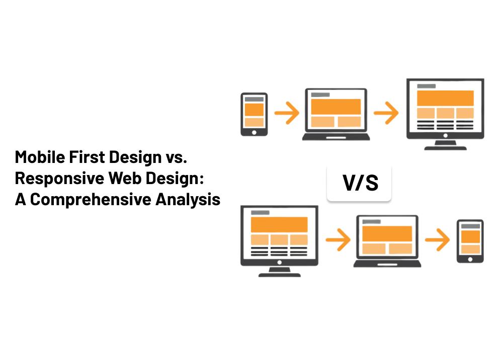
Mobile-first design is an approach where the design and development process starts with the mobile version of the website. Once the mobile version is designed, the desktop version of the website is rightly optimized for websites. The design in this approach is curated to accommodate mobile devices and their exact limitations rightly. The entire design is organized in such a way that challenges like smaller screen resolutions, and touch-based interactions could be eliminated. Mobile-first designs focus on creating a seamless and optimized experience for all mobile users.
The fundamental principles of mobile-first design include
Simplified User Interface: Mobile-first design prioritizes simplicity and minimalism to enhance usability on smaller screens. It offers a completely decluttered interface that can be used for better clarity and content consistency. This also helps to utilize effective elements like touch options on mobile screens for larger buttons and a more simplified navigation process.
Performance Optimization: Mobile devices often have slower connections and limited processing power compared to desktop computers. To optimize and handle this challenge, mobile-first designs optimize by effectively clearing caching files, minimizing file sizes, and eliminating lazy loading issues. It ensures that the websites load in no time without lagging.
Content Hierarchy: Mobile-first design encourages businesses to prioritize their content strategically. In mobile screens, there is a definite limitation in terms of screen size. This makes content organization and consistency a task to be rightly optimized. It is necessary to correctly identify and utilize the most critical content to maintain the right hierarchy of content from the top web design companies in the USA.
What does Responsive Web Design Mean?
Responsive web design is a definite approach where a website’s layout and elements adapt and respond to different screen sizes and resolutions. When rightly utilizing this approach, there is no need to create and evaluate designs dynamically for both website and mobile. Responsive design allows the website or mobile to adjust to smartphone, tablet, or desktop screen resolutions. So, the only thing needed is to hire the right web design company in New York.
Key principles of responsive web design include
Fluid Grids and Flexible Layouts: Responsive design employs fluid grids that automatically adjust the size of elements based on the screen width. This ensures the layout remains both consistent and proportional across several devices. It creates a visually pleasing and user-friendly experience.
Media Queries: These media queries are CSS techniques that offer different styles and rules of a device. It readily allows the website to adapt to any design presentation according to every user’s needs.
Device-Agnostic Approach: Responsive design aims to provide a consistent experience across various devices without sacrificing functionality. The best part is that it does not favor any particular device, making the updates and maintenance easy to work with and handle.
Importance of Mobile-First and Responsive Design for Businesses
Now that we have an understanding of both mobile-first design and responsive web design let’s delve into their importance for businesses:
Mobile-First Design for User Experience: Mobile users are ever-increasing, and businesses must recognize the mobile user experience. Adopting a mobile-first design approach allows companies to offer a seamless and effective user experience dedicatedly. This increases overall conversion rates and engagement and helps improve customer experience. But for a top-notch mobile-friendly design, connecting with the best web design company is crucial.
Responsive Web Design for Reach: A website that is responsive and easy to navigate can help businesses reach a larger audience base. This is because the website becomes more functional and easy to operate for users. Further, the adaptability of responsive designs in screen sizes also helps avoid excess hassle when managing a new design. This helps to enhance better visibility and brand consistency by increasing the overall level of website traffic as well.
SEO Benefits: Any Business, irrespective of its size and value, deliberately needs to improve its organic traffic and visibility. Adopting responsive and mobile-first design from the best web designing new york company helps to contribute and value for better SEO performance effectively. With its direct focus on a simplified user interface, performance optimization, and easy user interface, the mobile-first designs align with Google’s mobile-first indexing. Now, Google’s algorithm has a tendency to prioritize mobile-first indexing for websites. The responsive design, on the other hand, ensures that businesses get a consistent user experience for ranking on search engines
Search engine optimization (SEO) is definitely crucial for businesses to steadily improve their online visibility and attract organic traffic.
Mobile-First vs. Responsive Web Design: Which One Should You Choose?
The decision between Mobile First Design and Responsive Web Design depends on various factors, including your target audience, goals, and available resources.
Choose Mobile First Design if:
- The overall target users mainly consider mobile users respectively.
- You are looking to prioritize simplicity, user experience, and overall speed of mobile designs for a better experience.
- You have the resources and flexibility to invest in a separate mobile-first design and scale it up for larger screens.
Choose Responsive Web Design if:
- The target audience varies in age and uses both mobile as well as desktop devices.
- You are looking to optimize your website for all users without creating separate designs.
- You have limited resources and looking for a cost-effective solution for your web design
Lastly, responsive and mobile-first designs are crucial for businesses as both have merits and demerits. But before randomly selecting one, it is necessary to do proper research and then choose a professional web design company in New York. Further checking out some mobile-first and responsive design examples helps to understand better.
Conclusion
In today’s mobile-dominated world, mobile-first design and responsive web design play crucial roles in ensuring businesses succeed online. The mobile-first design focuses on creating an exceptional user experience, while the responsive design provides consistent and optimized experiences across all devices. Choosing between the two depends on a business’s target audience, specific goals, and resources for better value. However, regardless of the approach selected, companies must prioritize mobile optimization to stay competitive in the digital landscape and cater to the ever-growing mobile user base.