One of the most requested features in this Tech age is the Dark Theme. Both the platforms of Apple and Google have understood the requirement of users and made it an essential part of the UI. The dark theme provides safety to your eyes in the dark environments and certainly minimizes the strain in your eyes. If you are a web developer or a web designer this article is the right spot for you as Nico Digital’s research matter includes reference material from Nick Babich’s UX planet. Nick is the Editor in chief and a well-known figure in the world of blogs related to UX and UI design. Without further due let us discuss 8 strong tips that will help you design a dark theme for your product.
Don’t use a black background
It is never recommended that a dark theme has to be in black colour with white text on a pure black background. The high contrast might be disturbing for your eyes. It would be a wiser move to use Dark grey as the primary shade for the background rather than using pure black. The dark grey shade reduces eye strains. Try it yourself and you will understand the difference. There are plenty of case study examples to prove this statement that a light text on a dark grey surface would have lesser contrast than light text on a black surface. A dark grey surface can be more comfortable and pleasing to look at and expresses a wider range of color, elevation and depth because it is easier to see shadows on grey.
Using saturated colors on dark themes should be avoided
On light surfaces saturated colors can look great. Saturated colors can visually be more appealing against dark surfaces, causing problems to read. You could desaturate primary colors in order to balance the contrast against dark surfaces.
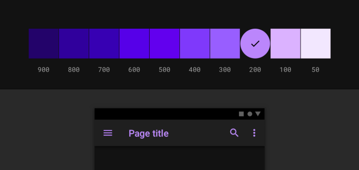
In such cases you should use lighter tones – (colours in the range of 200-50) because they have better readability on dark theme surfaces. Whereas in cases of lighter variants, they don’t make the UI less expressive but certainly help in maintaining appropriate contrast without causing discomfort in the eye.
Lookout for accessibility color contrast standards
Take it as a responsibility to make sure that your content remains visually comforting and legit in dark mode. The dark theme surfaces must be dark enough to display white text. It is more like a custom to use a contrast level of at least 15:8:1 between text and the background as recommended by Google Material design.
Using “On” colors – A high priority
The colors which appear to be on the top of key surfaces are ‘On’ colours. They are typically used for textual content. The default group of which for a dark theme is pure white and would be visually pleasant for dark backgrounds. That’s why google material design recommends using a slight darker white.
Let’s look a few factors you should keep in mind:
- 87% is the right value for opacity in cases of texts that require high emphasis
- 60% in cases of textual content which require medium emphasis
- 38% in cases of disabled texts
Tip: A dark background makes light text bolder than dark on light. Which is certainly a reason you should use lighter font weights for dark modes.
Keeping in mind that your design requires emotional attention
It is very important to ensure that you pass on the same vibe or spectrum of emotions when users switch to the dark theme. That communication is very essential. But it should be done very carefully because the background determines the visual experience of the users and colors might look different in different shades. That indicates that a dark theme won’t be able to represent the light theme. The result being that dark and light themes will always exhibit different emotions. It would be much better under these circumstances to take advantage of that for your product’s identity.
Try to provide Depth
Remember to create a hierarchy and emphasize important elements in your layout while creating a dark theme UI. The tool that can be used to communicate the elements can be ‘Elevation’. Whereas in light mode, we use shadows to express elevation. The higher the surface gets the wider a shadow it casts. Now that wouldn’t work in a dark theme. It gets difficult to perceive a shadow against a dark background. So, it’s better to illuminate the surface of each level.
The elevated surfaces and components are colored using overlays in cases of dark themes built with material. The higher the elevation of the surface, the lighter that surface becomes.
You should allow users to rotate from regular to the dark mode whenever they want.
You shouldn’t take control away from the user and let the system decide for them as to when they would want to switch from light to dark themes. This is a feature that should be easily accessible to them. However, you could provide them an option if they would like their system to decide it for them. More like (auto enabling dark theme).
Before launch you run a series of tests on your UI design in both light and dark appearances.
Run a series of tests in various light conditions to have an understanding of how your UI design looks in both appearances, make adjustments accordingly and then you’re set to launch.
Author Bio:
Aditya Kathotia
Aditya is the Founder and CEO of Nico Digital and Digital Polo. He has attained the pinnacle of brand design expertise by delivering true value to brands and marketers. After pursuing his higher education in Business Analysis from Manchester Business School, he has helped both Nico Digital and Digital Polo unlock its true branding potential globally. You can reach out to him on LinkedIn and Twitter.