Visual representation of data is the cornerstone of analytics. Incubating insights from a barrage of data can be daunting, and charts help simplify and prioritize this process. Data science has evolved to include specific visualization types for different data sets. One valuable and often misunderstood tool in this toolbox is the treemap chart. Below, we delve into the details of what is a treemap chart and how it’s vital to your company’s decision-making process.
Understanding the Basics
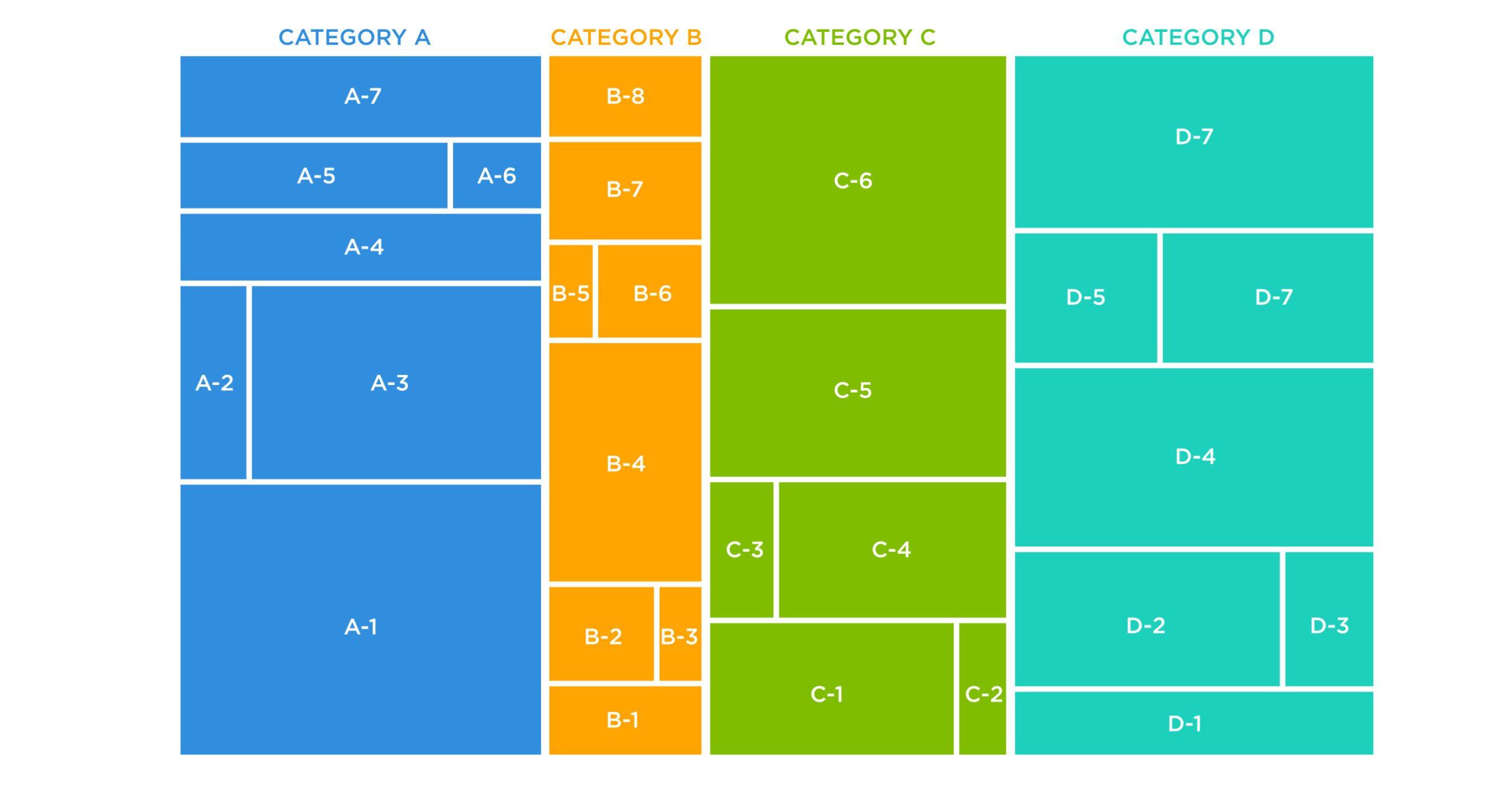
A treemap chart is a unique data visualization tool that elucidates data’s hierarchical structure and quantity. It presents multi-dimensional data in a compact, space-efficient manner. Rectangular boxes represent different levels, and their size and color correspond to particular variables.
This type of chart was designed to facilitate easy understanding of complex hierarchical information. It presents data in a simple layout that fits ideally in a confined space, making it suitable for a variety of data display needs.
The intricate layout makes it viable to include an overwhelmingly large number of records, which is generally cumbersome to manage and interpret in other charts.
Each segment of the chart correlates to a data element, and the size and color of the rectangle symbolize numerical values. This enables users to observe patterns, trends, outliers, and exceptional data points at a glance.
Key Components of a Treemap Chart
Alt text: A treemap chart example with rainbow-colored rectangles and an image of a tree in the center.
Despite being comparatively complex, treemaps only consist of three main components: rectangles, branches, and leaves. The rectangles, differing in size and color, symbolize data sets. They are the main components that visually represent the essence of the information.
Branches fractionate the rectangles into smaller sectors. This manifests the diverse levels of hierarchy within the data. The notion of hierarchy becomes possible by dividing data into categories and subcategories signified by the wide-ranging rectangles and branches.
The leaves, on the other hand, present the smallest data division in the hierarchy. They represent individual data points within a category or subcategory. The area of a leaf signifies the magnitude of its corresponding data set.
The color intensity of the rectangles and leaves depicts attribute value, assisting in identifying correlations or outliers. Consequently, viewers can extract meaningful insights about the significance of particular elements in the overall data set.
Implementing Treemap Charts in Business: An Analytical Tool
Alt text: An example of a treemap chart with different colored rectangles against a black background.
In the business world, leveraging treemaps can significantly enhance data analysis. For instance, they can meticulously display sales data, customer segmentation, and product categories, providing clear visibility of key performance indicators (KPIs).
Treemaps can illustrate the importance of different segments in a portfolio or the performance of different sectors in an industry. A glance at the treemap can quickly inform which product is performing well and which is underperforming based on the size and color of the respective rectangles.
Real-World Applications and Benefits of Treemap Charts in Business
Companies worldwide have integrated treemaps into their operations. They use them to portray a broad information spectrum, from internal performance metrics to market trends and predictions. This helps stakeholders understand the implications of the data at a single glance.
For instance, in the retail industry, treemaps have been used to represent sales data by product category, store location, or season. From these, insights about sales trends, profitable items, or peak selling periods can be discerned quickly and effectively.
Similarly, finance departments use treemaps to depict expense allocation or portfolio distribution. These aid in understanding the distribution of assets and liabilities, helping to make better investment decisions.
Treemaps prove to be an exceptional tool in data visualization. They offer insightful and visually appealing representations of intricate data sets when properly understood and harnessed. This certainly opens up new possibilities and perspectives in the realms of data interpretation and decision-making in business.