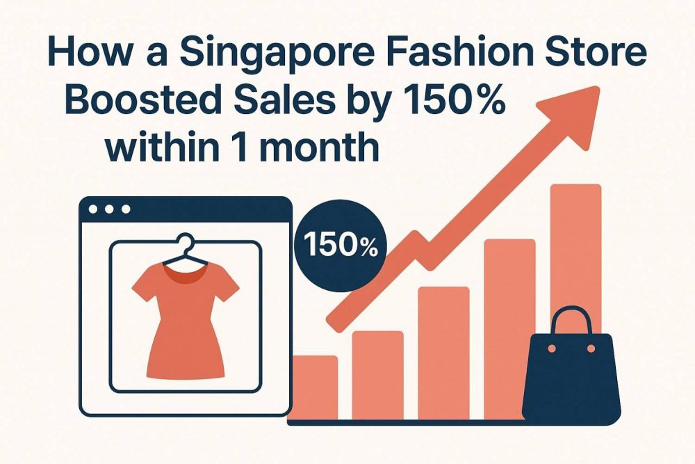
From Quiet Aisles to Sold-Out Styles—How One Singapore Store Grew Sales by 150% in 30 Days!
Can you imagine a small shop going from almost empty to super busy in just one month? That’s exactly what happened to a fashion store in Singapore!
This little store wasn’t getting many buyers. However, they then made a significant change. They didn’t buy new clothes or move to a new place. Instead, they utilised smart ads, engaging videos, and visually appealing pictures on Instagram and Facebook.
They showed how fun, trendy, and special their clothes were. People got excited! They liked, shared, and started shopping. Orders came flying in, and the store owners could hardly keep up.
It wasn’t just magic, but it sure looked like it! With the right ideas, even a small shop can shine bright.
Scroll down and explore how they improve fashion store sales. You’ll see how a great story, smart tools, and a bit of bold thinking can change everything!
The Problem: Why Their “Perfect” Website Failed
LuxeThreads, a stylish fashion store in Singapore. Their clothes look amazing. Their website looks pretty too—nice colours, cool pictures, and fancy fonts. But there was one big problem…
People weren’t buying.
Even though the website looked great but something was wrong behind the scenes. Let’s find out what happened:
1. Slow Loading Speed
LuxeThreads’ website took more than five seconds to load when a user clicks to visit their site. But according to today’s website, that’s too slow. Most shoppers expect pages to load in just 2 seconds or less. The longer it takes, the more people click away.
Even though the clothes were great, many visitors never got to see them because they didn’t wait for the page to load. That is why speed matters a lot for a website.
2. Non-responsive Design
More than 70% of LuxeThreads’ visitors were using mobile phones. But the site didn’t adjust well to smaller screens. Buttons were hard to tap, images were cut off, and scrolling didn’t feel smooth.
When a website doesn’t work well on phones, it makes shopping frustrating. Many mobile users gave up before even browsing.
3. Confusing Navigation and Checkout
The menu and layout of the site were hard to follow. Shoppers couldn’t easily find categories like “New Arrivals” or “Best Sellers.” Even worse, when they added items to their cart, the checkout process had too many steps.
There were no clear instructions, no progress bar, and some fields didn’t load properly. This caused people to abandon their carts and leave.
4. Product Page Optimisation
Each product page had only one or two images. Descriptions were short and lacked useful details like material, size guides, or styling tips. There were no customer reviews or size charts.
When people don’t get enough information, they don’t feel confident about buying. The result? Fewer sales, even for popular items.
LuxeThreads learned something big: A website can be beautiful, but that doesn’t mean it will work and give results.
Pretty pages don’t matter if users can’t use them easily. A great fashion store needs more than style, it needs speed, ease, and clear info. That’s why LuxeThreads had to fix more than just how things looked.
The Fix: 5 Game-Changing Strategies
LuxeThreads had a big problem. Their website looked nice, but it didn’t help them sell more clothes. So, they made some smart changes. These changes helped them grow fast, and in just 30 days, their sales went up by 150%!
Below are some marketing strategies for fashion store success:
Strategy 1: Speed Optimisation
Problem:
LuxeThread’s website looked pretty, but it took too long to load. When a user clicks on their site to visit, it takes more than 5 seconds just to load the page. That sounds a bit negative, right? But for online shopping, it’s too slow. People don’t want to wait long. They want the site to load fast, like in 2 seconds.
A slow site makes people click away before they even see your products. That means lost customers and lost money.
Action:
- Image Compression: They made big image files smaller so they still looked nice but loaded quicker.
- Better Hosting: They moved to a faster website server that could handle more visitors without slowing down.
- Plugin Cleanup: The website had too many extra tools (called plugins) that weren’t helping. They removed the ones that slowed things down.
Result:
Now, the website loads in just 1.8 seconds! That’s over twice as fast. People stopped leaving early. The bounce rate (how many people leave quickly) dropped by 40%.
Subtle Plug:
Our eCommerce website design company doesn’t just make sites look good, we make them even faster. Because speed isn’t just a nice-to-have, it’s the first thing shoppers notice. A slow site can lose sales before your page even shows up.
Strategy 2: Mobile-First Redesign
Problem:
Even though 7 out of 10 visitors were on their phones, the website didn’t work well on small screens. Words were too tiny to read. Buttons were hard to tap. Pages didn’t fit the screen properly.
This made it hard and annoying for mobile users to browse or buy. Many gave up and left.
Action:
- Thumb-Friendly Buttons: Big buttons were added so shoppers could easily tap with their thumbs. They made a mobile-optimised website for their fashion store that helped user to use their site with ease.
- Sticky Add to Cart: A button that always stays on the screen made it easy to add items anytime.
- Simple Layout: They cleaned up the design to remove clutter and made it scroll-friendly.
Result:
People found it easier to browse and shop on their phones. Mobile conversions (people who buy using phones) tripled!
Takeaway:
Mobile isn’t just important, it’s the main stage. If your store doesn’t work smoothly on phones, you’re losing most of your audience before they even see your products. Always design for fingers first, not just mouse clicks.
Strategy 3: Persuasive Product Pages
Problem:
Each product had only 1 or 2 pictures. The descriptions were short and plain. For example, a dress might be listed as “Elegant Black Dress.” That information is not enough! Shoppers must highlight the features, quality, material they use, and colour options.
Also, there were no customer reviews or frequent answers to questions, which helps users the most to know more about the products.
Action:
- Sensory Descriptions: They added words that made customers imagine wearing the clothes, like “soft cotton that flows” or “perfect for warm evenings.”
- FAQS: They answered common questions right on the page to build confidence.
- Urgency Cues: Little messages like “Only 3 left!” made people buy quicker.
Result:
Shoppers now spend twice as much time on each product page, and they are more likely to buy.
Pro Tip:
Write every product description like you’re talking to someone who’s never seen it before. Help them feel the fabric, imagine the fit, and know why they need it. Provide them with information before they even think to ask.
Strategy 4: Streamlined Checkout
Problem:
Shoppers would add products to their cart but leave without completing the purchase. The reason? Check out had four steps! And shoppers had to sign up before they could pay. That made it feel like too much work.
Action:
- One-Page Checkout: Everything needed to buy was placed on just one easy screen.
- Guest Option: Shoppers could now buy without creating an account.
- Local Payment Methods: They added trusted, easy ways to pay in Singapore, like PayNow and GrabPay.
Result:
The checkout became fast and friendly. People stopped quitting halfway. Cart abandonment dropped by 60%.
Subtle Plug:
Our checkout flows are built to make buying easy. We believe that when a user wants to pay, you should get out of their way, not slow them down. Every second saved = more sales gained.
Strategy 5: Building Trust
Problem:
Even with pretty clothes and good prices, new visitors weren’t buying. Why? Because they didn’t feel safe or sure about the store. There weren’t enough signs that real people liked the products. There was no quick help if they had a question. And the return rules weren’t easy to find.
Action:
- Photo Reviews: Satisfied customers posted images of themselves dressed in the clothing.
- Live Chat: A small button lets shoppers chat with a team member in real time.
- Clear Return Policy: The rules for returns and refunds were shown clearly on the product pages.
Result:
First-time buyers finally felt safe and supported. There will be a 90% increase when people buy first time!
Lesson:
People make purchases not from websites, but from brands they trust and believe in. When your store feels honest, friendly, and helpful, shoppers feel good about hitting that ‘Buy’ button. Trust is the foundation of every sale.
The Bigger Lesson: Your Website as a 24/7 Sales Machine
While you’re resting at night, your website can still be working. That’s the magic of having a strong online store. For LuxeThreads, sales didn’t just happen during the day. They observed that customers were purchasing clothing even around midnight. In other words, their website kept making sales even while everyone was asleep.
That’s what an innovative website does—it works 24 hours a day, 7 days a week.
Another big win? When LuxeThreads ran a big promotion, their site didn’t crash. Before, too many shoppers at once caused slow pages or errors. But after fixing their site speed and design, it could handle lots of traffic, even during big sales. No more missed chances.
They also started saving money. How? With a better website, they didn’t need to spend as much on ads. This increases the online fashion store’s revenue. People stayed longer, bought more, and shared their experience. So even when they paused paid ads, their sales kept going strong. That’s a big win for any business.
Here’s the bigger lesson:
A good website is like a great worker. It never takes breaks, doesn’t call in sick, and always shows up.
A well-designed site works for you forever—no overtime pay required.
So if your store is online, make sure it’s built to sell anytime, anywhere. Whether it’s morning or midnight, your website should always be ready to help customers buy what they love.
Could Your Site Use a Boost?
Your website looks nice, but is that helping you sell?
Let’s find out! Start with this checklist:
Is your site slow to load?
Is it difficult to navigate on a mobile device?
Are shoppers leaving without buying?
What We Offer:
We help fashion stores and online shops fix these problems and more. Here’s how we boost your website and grow your sales:
- Custom Solutions
You’re not like other stores, so why use the same website design? We build custom sites made just for you. It will reflect your style, align with your brand, and help you stand out.
- Speed Optimisation
We make your site super fast. That means shrinking big pictures, removing useless plugins, and giving you better hosting. Fast sites make shoppers happy, and they are willing to buy more.
- Mobile-First Design
We design your site for phones first. So whether someone shops from your couch or a café, they’ll have a smooth and fun experience.
- Free Website Audit
Want to see how your site is doing? We’ll check it for free! We’ll tell you what’s working and what’s slowing things down. No pressure, just honest help.
Ready to Give Your Site a Boost?
Your website ought to be your top performer, promoting your products around the clock.
Let’s make that happen.
Book a free consultation with our expert team.
or
Download our free checklist to see what your site may be missing.
Conclusion
A beautiful website isn’t enough, it must be fast, mobile-friendly, easy to navigate, and built with trust in mind. LuxeThreads proved that with the right fixes, from faster load times and mobile-first design to better product pages and seamless checkout, sales can skyrocket, even without increasing ad spend. Their story shows that your website can become a 24/7 sales machine, which converts visitors into loyal customers. If your current site isn’t delivering results, it may be time for a transformation that turns browsers into buyers and style into sales.