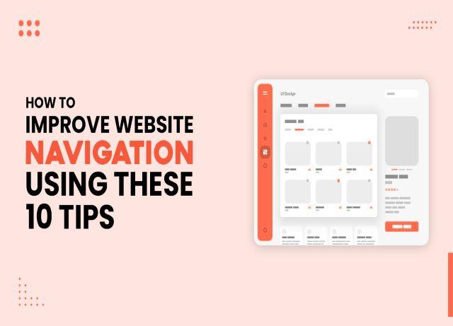
The most important aspect of the overall user experience is website navigation, which can make or break your conversion chances. Maintaining high user retention and low bounce rates requires a solid site navigation system.
Website navigation is one factor that can make or break your site’s UX design. An easily navigable website will assist users in finding the content they seek while providing a positive experience that will entice them to return.
Impressive Chicago Web Design use good navigation to support company objectives while providing users with a streamlined experience on desktop and mobile. In this article, we’ll review the fundamentals and give some tips on designing your site.
Here are the following 10 tips to Improve Website Navigation:
1. Prioritize your pages:
Consider where you want visitors to go first when creating your hierarchy. Of course, your objectives will vary depending on the type of website you’re creating, but here are a few guidelines to keep in mind:
- How are you going to guide visitors through your funnel?
- What is the most important information for you and your visitors?
- What is the purpose of a visitor’s visit to your website, and can they easily achieve it using your navigation menu?
These pages are part of your primary navigation and should be available via your site’s main menu.
2. Incorporate Calls-To-Action (CTAs):
CTAs are critical for directing users to the desired destination. The right CTA can also help you increase your click-through rate and convert more leads into customers. These buttons are also useful when you want a potential customer to fill out a form, share your content online, or even register for an event. Precise and catchy phrases will outperform the standard “click here” button.
3. Make hypertext visible:
One of the most common issues is allowing the design to obstruct usability. For example, you have a problem if visitors can’t tell a hyperlink from the body copy.
The easiest way to differentiate hypertext is to make it stand out from all other aspects of the page, not just when the visitor rolls their mouse over the link. So make it a different color, underline it, or bold it. You can even make your header navigation links into buttons if you want.
4. Make it simple to find the search feature:
Creating a search feature is essential if you want your users to be able to access the content on your website. The optimal placement of the search feature will allow visitors to conclude their search and begin exploring the solutions. For example, this is how Amazon designed its website’s search feature.
5. Check that the navigation is “mobile-first” ready:
Among the numerous reasons is Google’s mobile-first indexing, which means the search engine giant primarily indexes the website’s mobile version. Google also recently announced that mobile-first indexing would be enabled by default for all new websites.
Mobile devices have limited space and require a different layout to look good and be usable. There are numerous excellent solutions for responsive navigation based on CSS, jQuery, or JavaScript. For example, responsive menus expand and collapse on touch, slide or fly out, are presented in a card grid, and so on.
6. Link your logo back to the homepage:
This popular web design blunder can be easily ignored. The word “Homepage” does not have to be included in your menu. Rather, place your logo at the top of each page of your website and link it to the homepage. For most of your users, this will be a very natural action (hello again, web design conventions.). Logos are frequently seen on the left-hand side of a website’s header, but their exact placement varies. The most thing is that your logo will appear near the top of your site, near your menu.
7. Make it simple to navigate from one page to another:
Users should be able to move from one page to another without difficulty, so in addition to including links to other pages on your website, make all pages accessible from the navigation bar. Consider the information architecture flow when designing the menu bar. Navigation icons help users find what they need quickly and easily.
8. Don’t forget the footer:
If you use WordPress, thousands of themes are available, including fat footers. Could you take advantage of them? You don’t need to include dozens of links, but make good use of the available space.
You should repeat the header navigation bar in some cases. Then, people won’t have to scroll up to find the link they’re looking for.
9. Provide ALT text for clickable images:
Another practice for improving website navigation that overlaps with web accessibility. Images should have ALT text that describes their contents. In addition, clickable images that serve as navigation items on your website should describe the linked page in the navigation context.
10. Ensure that visitors can access any page from any other page:
Finally, and as a rule, visitors should be able to navigate to any page they want from any page. Remember that not everyone will find your website through its homepage. Therefore, any subsequent pages they visit should be linked to the rest of your website.
To make things even easier, keep the website menu design consistent across all pages, placing it in the same spot to avoid confusion. To make things even easier, keep the website menu design consistent across all pages, placing it in the same spot to avoid confusion.
Conclusion:
Easy website navigation is critical for guiding visitors through the buyer journey and ultimately converting them. Business owners should know their goals and align their navigation strategy to support them. Overcomplicating menus, making certain features difficult to find, and using misleading words will quickly confuse visitors and cause them to abandon your page, costing you valuable conversions! The navigation UX directly affects the time users spend on your website, their opinion of your web design Chicago company, and their decision to purchase, so use best practices to provide an exceptional navigation experience.


