Introduction
To display pop-ups in Xamarin cross-platform apps, developers frequently use a [Dialog/Alert/Interaction] Service. If we need to display an information message or ask the user simple questions with positive and negative replies, this method is appropriate and clean. But what if we require a more complex UX, such as a login experience? As Xamarin has tremendous solutions for several UI based aspects and allow us to create functionalities such as Xamarin Behaviours for UI, you can seamlessly utilize inputs and actions to the existing pop-up service and this is shown below.
public interface IPopUpService
{
IDisposable Alert(
string title,
string message,
IEnumerable<PopUpInputViewModel> inputs,
IEnumerable<PopUpActionViewModel> actions
);
IDisposable Select(
string title,
string message,
IEnumerable<PopUpActionViewModel> actions
);
}
However, consider the difficulty of this service’s use, particularly if we require some validation that must be tested.
On iOS and Android, we can utilize a normal ViewModel with a specific platform-dependent presentation that leverages UIAlertController and DialogFragment, respectively.
Advantages
- The pop-up presentation is irrelevant to the ViewModel layer.
- Like any other ViewModel, the ViewModel with pop-up presentation can be tested.
- Because it is not dependent on a generic service, the ViewModel with pop-up presentation has a lot more room to implement specific features.
Because it does not rely on any generic service, the ViewModel with pop-up presentation has a lot more room to build specific features.
Let’s make a custom pop-up using the instructions below:
- ViewModel Implementation
- Android View Implementation
- IOS View Implementation
ViewModel Implementation
We have a simple ViewModel that represents an authentication screen on the ViewModel layer. Username and Password text, as well as Close and Login instructions, are included in this LoginViewModel:
public class LoginViewModel : MvxNavigationViewModelResult<string>
{
public string Username { get; set; }
public string Password { get; set; }
public ICommand LoginCommand { get; }
public ICommand CancelCommand { get; }
public LoginViewModel(IMvxLogProvider logProvider, IMvxNavigationService navigationService)
: base(logProvider, navigationService)
{
LoginCommand = new MvxAsyncCommand(LoginAsync);
CancelCommand = new MvxAsyncCommand(CancelAsync);
}
private Task LoginAsync()
{
return NavigationService.Close(this, Username);
}
private Task CancelAsync()
{
return NavigationService.Close(this, null);
}
}
Because the purpose of this post is to show how to construct the pop-up presentation, no authentication mechanism has been implemented. However, here are a few highlights:
- The Login command closes the ViewModel and returns the text from the Login property as a navigation result.
- This ViewModel is simply closed when you use the Cancel command.
Android View Implementation
On the Android platform, unlike iOS, we may use MvvmCross’s default features to display a dialogue.
We’ll need a DialogFragment with a custom view that includes text fields for Login and Password:
[MvxDialogFragmentPresentation]
[Register(nameof(LoginDialogFragment))]
public class LoginDialogFragment : MvxDialogFragment<LoginViewModel>
{
public override Dialog OnCreateDialog(Bundle savedInstanceState)
{
return new AlertDialog.Builder(Activity)
.SetTitle(“Login”)
.SetPositiveButton(“Login”, (_, __) => ViewModel.LoginCommand.SafeExecute())
.SetNegativeButton(“Cancel”, (_, __) => ViewModel.CancelCommand.SafeExecute())
.Create();
}
public override View OnCreateView(LayoutInflater inflater, ViewGroup container, Bundle savedInstanceState)
{
base.OnCreateView(inflater, container, savedInstanceState);
return this.BindingInflate(Resource.Layout.Login, null);
}
public override void OnActivityCreated(Bundle savedInstanceState)
{
base.OnActivityCreated(savedInstanceState);
if (Dialog is AlertDialog alertDialog)
{
alertDialog.SetView(View);
}
}
}
Important considerations to keep in mind when implementing such a dialogue:
- MvvmCross uses the MvxDialogFragmentPresentationAttribute to determine how to present this particular View. For more details, consult the documentation.
The OnCreateDialog function creates and configures the AlertDialog. Here, we utilize 2. AlertDialog.Builder to set up the positive and negative buttons, as well as the title, description, and other options. As we apply binding, the custom content view should be set later.
3.Because it’s impossible to properly bind the dialogue buttons and commands, we use button click listeners to execute the required commands.
4. We know our custom view has been inflated and bindings have been formed as soon as the OnActivityCreated method is called. The AlertDialog’s View has now been configured.
Two TextInputs and binding descriptions connect the entered text with properties of the LoginViewModel in the LoginDialogFragment’s layout:
<?xml version=”1.0″ encoding=”utf-8″?>
<LinearLayout xmlns:android=”http://schemas.android.com/apk/res/android”
xmlns:app=”http://schemas.android.com/apk/res-auto”
xmlns:tools=”http://schemas.android.com/tools”
android:layout_width=”match_parent”
android:layout_height=”wrap_content”
android:orientation=”vertical”
android:padding=”16dp”>
<com.google.android.material.textfield.TextInputLayout
style=”@style/Widget.MaterialComponents.TextInputLayout.FilledBox”
android:layout_width=”match_parent”
android:layout_height=”wrap_content”
android:hint=”Username”>
<com.google.android.material.textfield.TextInputEditText
android:layout_width=”match_parent”
android:layout_height=”wrap_content”
app:MvxBind=”Text Username” />
</com.google.android.material.textfield.TextInputLayout>
<com.google.android.material.textfield.TextInputLayout
style=”@style/Widget.MaterialComponents.TextInputLayout.FilledBox”
android:layout_width=”match_parent”
android:layout_height=”wrap_content”
android:hint=”Password”>
<com.google.android.material.textfield.TextInputEditText
android:layout_width=”match_parent”
android:layout_height=”wrap_content”
android:inputType = “textPassword”
app:MvxBind=”Text Password” />
</com.google.android.material.textfield.TextInputLayout>
</LinearLayout>
On the Android platform, the LoginViewModel’s whole pop-up presentation should look like this:
IOS view implementation
The iOS portion is a little more complicated, and a custom presentation must be used, but the concept is simple:
- Create a custom MvxAlertPresentationAttribute that the presenter will handle.
- Create a UIViewController-derived basic class that encapsulates the development of UIAlertControllers.
- Extend the default MvxIosViewPresenter to process and display the new presentation attribute.
- Create a LoginViewController.
- MvxAlertPresentationAttribute
This custom attribute holds all of the information required to set up the UIAlertController:
public class MvxAlertPresentationAttribute : MvxBasePresentationAttribute
{
public static UIAlertControllerStyle DefaultPreferredStyle = UIAlertControllerStyle.ActionSheet;
public UIAlertControllerStyle PreferredStyle { get; set; } = DefaultPreferredStyle;
public string Title { get; set; }
public string Message { get; set; }
}
The PreferredStyle property must be set before the alert is displayed. ActionSheet is the default recommended style. If the alert content is dynamic or a localization method is used, the Title and Message properties are optional and can be assigned later.
- MvxAlertViewController
The MvxAlertViewController, which wraps the alert creation, is declared next. This is the class from which we will derive our LoginViewController.
The MvxAlertViewController derives from the MvxViewController and has two major functions: it produces a UIAlertController and provides an easy API for configuring the alert.
Technically, it configures itself as the UIAlertController’s content and sets the appropriate content size:
public UIAlertController Wrap(MvxAlertPresentationAttribute attribute, MvxIosViewPresenter viewPresenter)
{
_viewPresenter = viewPresenter;
_alertController = UIAlertController.Create(
attribute.AddTitle,
attribute.MyMessage,
attribute.PreferredStyle
);
_alertController.SetValueForKey(this, new NSString(“contentViewController”));
var preferredContentSize = new CGSize(1, 1);
PreferredContentSize = preferredContentSize;
_alertController.PreferredContentSize = preferredContentSize;
return _alertController;
}
The Wrap method’s result will be passed to the custom MvxIosViewPresenter, which will present the built UIAlertController.
We could now take care of our MvxAlertViewController’s users by implementing some convenience methods that allow them to customise alerts, add text fields, and perform actions.
First and foremost, the UIAlertController’s Title and Message attributes should be accessible and made bindable:
public override string Title
{
get => _alertController.Title;
set => _alertController.Title = value;
}public string Message
{
get => _alertController.Message;
set => _alertController.Message = value;
}
The ability to create text fields is therefore required:
protected UITextField AddTextField()
{
if (_alertController.PreferredStyle != UIAlertControllerStyle.Alert)
{
return null;
} var textField = default(UITextField); _alertController.AddTextField(view => textField = view); return textField;
}
Add Action Method:
protected UIAlertAction AddAction(ICommand command, string title)
{
var AlertAction = UIAlertAction.Create(title, style, async _ =>
{
command.SafeExecute();
await _viewPresenter
.CloseModalViewController(_alertController, new MvxModalPresentationAttribute())
.ConfigureAwait(false);
});
_alertController.AddAction(alertAction);
if (isPreferred)
{
_alertController.PreferredAction = alertAction;
}
return alertAction;
}
The call to the CloseModalViewController method is the most interesting aspect of this method: we must explicitly tell MvvmCross to remove our modal view controller from the navigation stack, or else the navigation will be broken.
- MvxAlertIosViewPresenter
We need to register MvxAlertPresentationAttribute in the function Object() { [native code] } so that the new presenter knows how to show and close the view with MvxAlertPresentationAttribute.
ShowAlertVview and CloseAlertView:
private Task<bool> ShowAlertView(
Type viewType,
MvxAlertPresentationAttribute attribute,
MvxViewModelRequest request
)
{
var viewController = this.CreateViewControllerFor(request);
if (!(viewController is IMvxAlertViewController alertViewController))
{
return Task.FromResult(false);
}
var alertController = alertViewController.Wrap(attribute, this);
var modalPresentationAttribute = new MvxModalPresentationAttribute
{
WrapInNavigationController = false
};
return ShowModalViewController(alertController, modalPresentationAttribute, request);
}
private Task<bool> CloseAlertView(IMvxViewModel viewModel, MvxAlertPresentationAttribute attribute)
{
return CloseModalViewController(viewModel, new MvxModalPresentationAttribute());
}
The ShowAlertView function is the most intriguing; we use the default technique to construct the ‘real’ view controller and wrap it in the alert.
- LoginViewController
Finally, everything was set up, and the LoginViewController could be used:
[MvxAlertPresentation(PreferredStyle = UIAlertControllerStyle.Alert)]
public class LoginViewController : MvxAlertViewController<LoginViewModel>
{
public override void ViewDidLoad()
{
base.ViewDidLoad();
Title = “Login”;
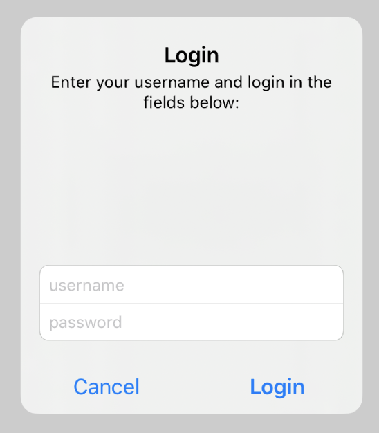
Message = “Enter your username and password”;
var usernameTextField = AddTextField();
usernameTextField.Placeholder = “username”;
var passwordTextField = AddTextField();
passwordTextField.Placeholder = “password”;
passwordTextField.SecureTextEntry = true;
AddAction(ViewModel.CancelCommand, “Cancel”, UIAlertActionStyle.Cancel, false);
AddAction(ViewModel.LoginCommand, “Login”, UIAlertActionStyle.Default, true);
var set = this.CreateBindingSet<LoginViewController, LoginViewModel>();
set.Bind(usernameTextField).To(vm => vm.Username);
set.Bind(passwordTextField).To(vm => vm.Password);
set.Apply();
}
}
As you can see, the final view controller is quite straightforward to implement.
- Set the preferred style for the MvxAlertPresentation attribute.
- Bind or set the properties Title and Message.
- Make text fields and tie them together.
- Make a plan.
Unfortunately, we can’t correctly bind UIAlertActions without using custom binders. Although not the subject of this article, text fields, titles, and messages could all be bound.
On the iOS platform, the LoginViewModel’s whole pop-up presentation should look like this:


Conclusion
Using Xamarin and MvvmCross, we have seen the detailed demonstration of how to create cross-platform, maintainable, and tested pop-ups.
Author Bio: Vinod Satapara – Technical Director, iFour Technolab Pvt. Ltd.
Technocrat and entrepreneur of a reputed PowerPoint Addin Development Company with years of experience in building large scale enterprise web, cloud and mobile applications using latest technologies like ASP.NET, CORE, .NET MVC, Angular and Blockchain. Keen interest in addressing business problems using latest technologies and help organization to achieve goals.